
Excel doesn’t offer a built-in 3D scatter plot. It do offer a 3D line chart (multiple line series presented side by side) but that cannot be easily adapted to scatter plot unless one of the variables is integer with only handful of distinct values. Recently I discovered a Gabor’s Doka the 3D scatter plot for MS Excel, an excel spreadsheet with built-in formulas and macros that offers 3D scatter plot functionality. It offers more-or-less all functionality I wanted so I decided to took the logic from Gabor’s workbook, transformed it into a pure VBA code without any excel formulas; and have it as a more user-friendly version available in BESH Stat add-in starting from version 0.22.
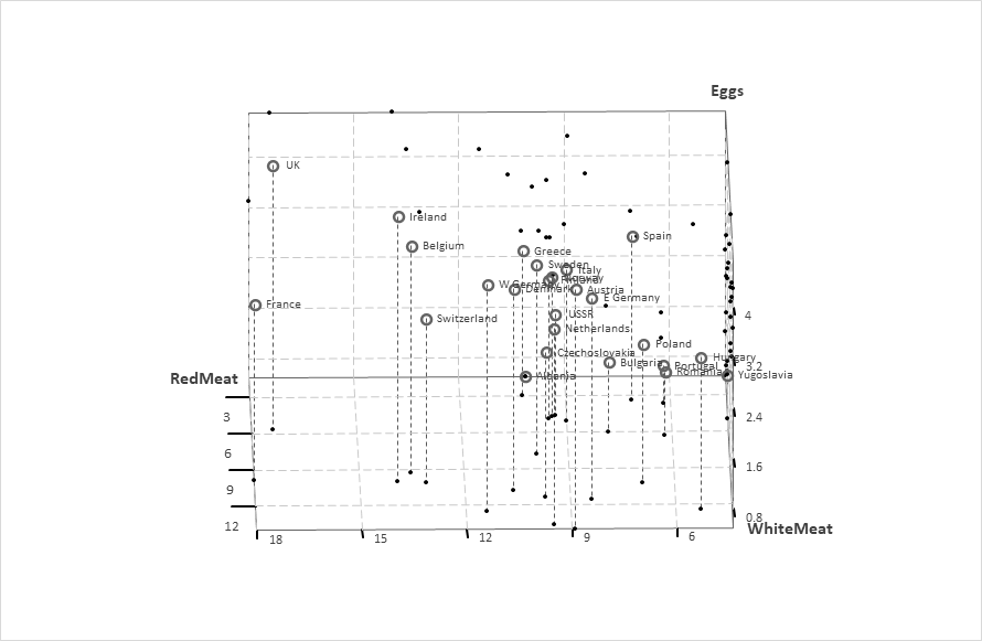
So what is the result? Let’s use the protein data as an example. The protein data set is a real-valued multivariate data set describing the average protein consumption by citizens of 25 European countries. For each country, there are nine columns, corresponding to the different types of proteins. I will use the Read Meat, White Mean, and Eggs to create a 3D scatter plot.
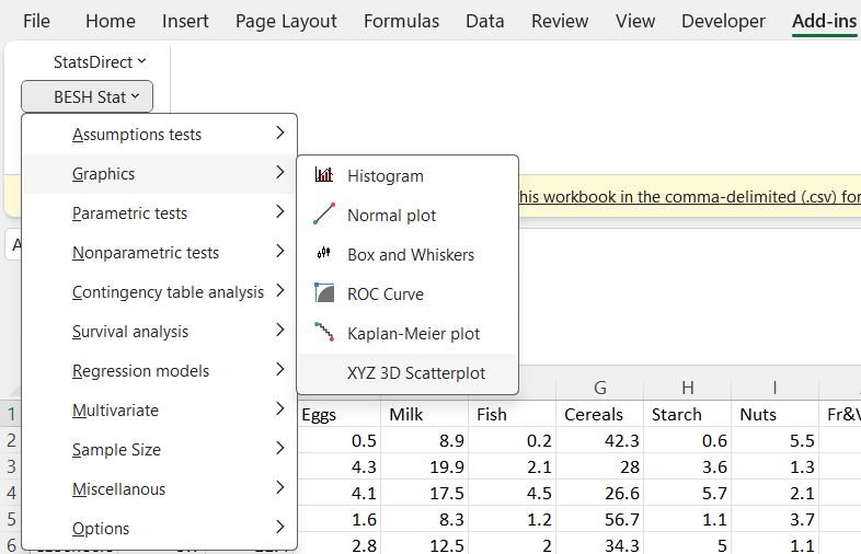
Download BESH Stat version 0.22 or later, install it. Then open protein.csv file go to add-ins tab, click on BESH Stat → Graphics → XYZ 3D Scatterplot as on the figure below.
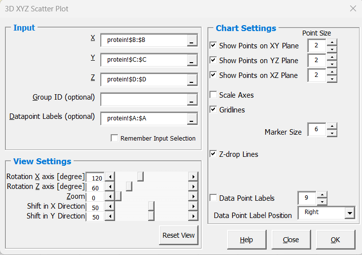
Make the following selection on the userform (whole Column B as X variable, Column C as Y variable, and column D as Z variable; I have also selected Column A as Datapoint Labels, because I will use it later in the example). Keep all other settings as-is to create a draft of our 3D scatter plot. We will be adjusting the settings interactively later on to get desired output.
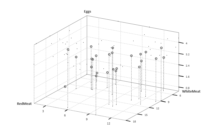
Plot with the default view settings (projection of 3D plot onto the 2D – x-axis rotation = 120 degrees; z-axis rotation = 60 degrees; zoom=0; x and y shift = 50 (i.e. in the middle of the chart area)) looks like follows:
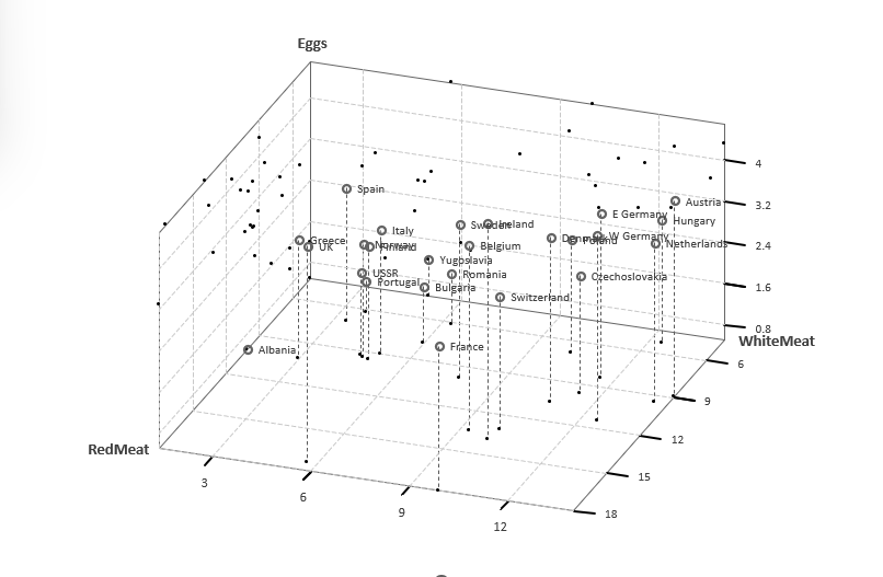
BESH Stat output chart on the separate chart-sheet (it’s not possible to create it as a embedded chart within a sheet). Let’s change the rotation to 130, 70; check the Data Point Labels option and increase the font size to 10pt; increate the point size on XY/XZ/YZ planes projection to 3 to better visualize the location of points in 3D space. Plot is dynamically updated in real-time as you make the changes.
Click Close button, once you are happy with the output. More modifications are possible using options on the standard excel Chart design tab or by double clicking on individual chart elements (labels, points, chart series etc.). BESH Stat does also add a legend to the chart but only when by-group chart is created (selected the group ID optional input).
I’ve exported chart as image while rotating along x-axis (first animated gif) and z-axis (second animated gif) to mimic BESH stat behavior when you keep then X rotation spinbar arrow click and excel recalculate the chart position in real-time. The setting were as follows:
x-rotation: changing from 0 degree to 359 degree while keeping everything else constant (zoom=1; z-rotation=60 degrees; point-size for XY, XY, YZ plane points projection = 3; gridlines option checked; Z-drop Lines option checked; Datapoint Labels option checked)

z-rotation: changing from 0 degree to 359 degree while keeping everything else constant (zoom=1; x-rotation=120 degrees; point-size for XY, XY, YZ plane points projection = 3; gridlines option checked; Z-drop Lines option checked; Datapoint Labels option checked)
Note: BESH Stat doesn’t have capabilities to create animated gifs. It was used in the above example to generate source images that were alter on plugged into the ezgif.com to create animation.
IRIS data example
One more animated example using IRIS data, presenting sepal length on x-axis, sepal width on y-axis, petal length on z-axis, and class as a grouping variable. Series of charts were created with 1 degree increment in z-axis direction starting from 0 to 90 degrees, then 5 degrees total increment with 1 degree step in x-axis direction starting from 90 degrees; and finally -1 degree increment in z-axis direction starting from 90 to 0 degrees; and repeated until x-axis tilt reached 180 degrees.
About 1800 charts were created in total and combined to animated gif using the ezgif.com . Note: x-axis rotation between 90 and 180 degrees; z-axis rotation between 0 and 90 degrees are recommended in order to not get “behind” the projection planes.
